Prisere
Sept - Dec 2025
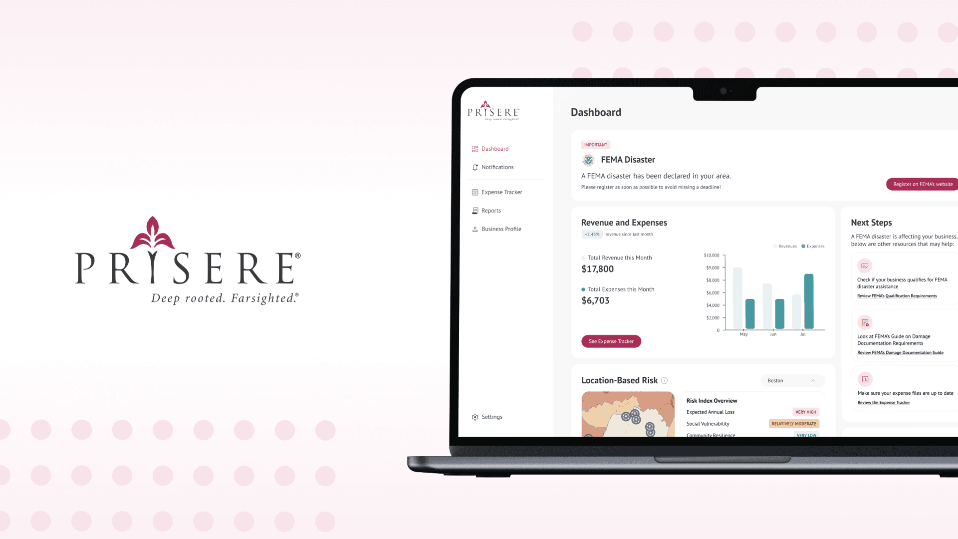
Team
1 Project Lead, 7 Software Engineers, Zahra Wibisana (Design Lead), Nour Tawfik, Tara Standard, Traci Lu
Impact
Designed 4 of 7 primary user-facing pages, shaping the Dashboard, Notifications system, Business Profile, and Settings experience from initial ideation to final high fidelity screens
Small businesses are 43% more likely to close permanently after disasters. Without tools to prepare or file claims quickly, it causes closures, which also taking jobs and community services with them.
About
Prisere is an insurance innovation platform built to help small and medium-sized businesses (SMBs) prepare for and recover from disasters. Amidst all the chaos, Prisere offers a simple, all-in-one platform that works with the user to make the insurance claims process smoother.
Existing tools cater to large businesses with teams of analysts, leaving many SMBs at risk. I used competitive analysis, community feedback, and online research to understand the insurance claims process and points causing friction for business owners.

Problem
How might we design a platform that helps small business owners prepare for and recover from disasters without overwhelming them?
Research & Process
To design for an innovative platform, I analyzed competitors like Quickbooks and found a detrimental pattern. Too often, these platforms contained dense data visualizations & overwhelming UI.
General Pain Points:
Cognitive Overload:
In a disaster, a user doesn't have the bandwidth to decode complex wording, numbers, or buttons. For a business owner potentially facing closure, dense data becomes a barrier, not a tool
Failure to Account for User Emotional State:
Existing platforms don't account for negative, stress-induced emotions owners might face.
In reality, business owners in crisis are managing stress, time pressure, and high-stakes decisions simultaneously
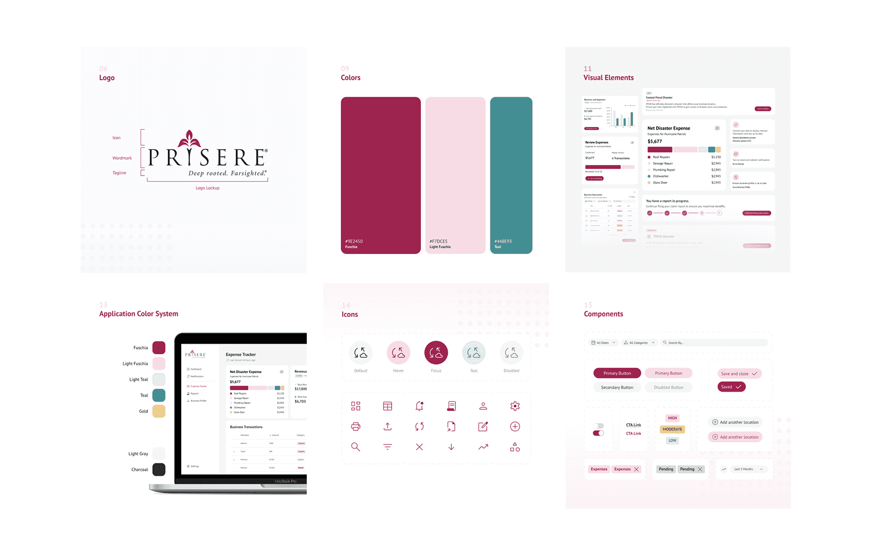
I began by considering the overall flow of the site through the perspective of a user.
Things I focused on as I was mapping the page out:
Immediate Clarity on Entry
A Sense of Progress
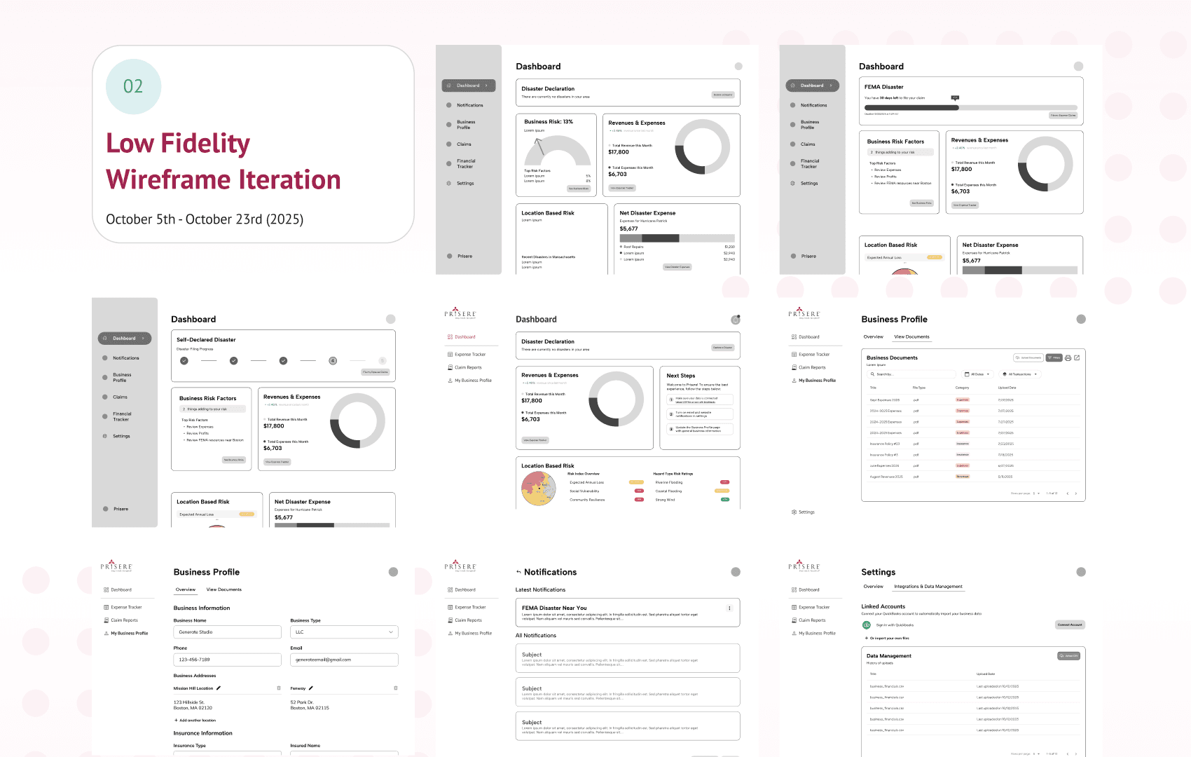
Early Wireframes — Dashboard
While designing the dashboard, I heavily focused on designing for a user with zero mental bandwidth.
Reprioritization of CTAs: I shifted the hierarchy, prioritizing 'Next Steps' with actionable wording
Identified critical gap: Needed a "central hub" of business documents page to centralize data for claims documentation (Turned into Business Profile page)

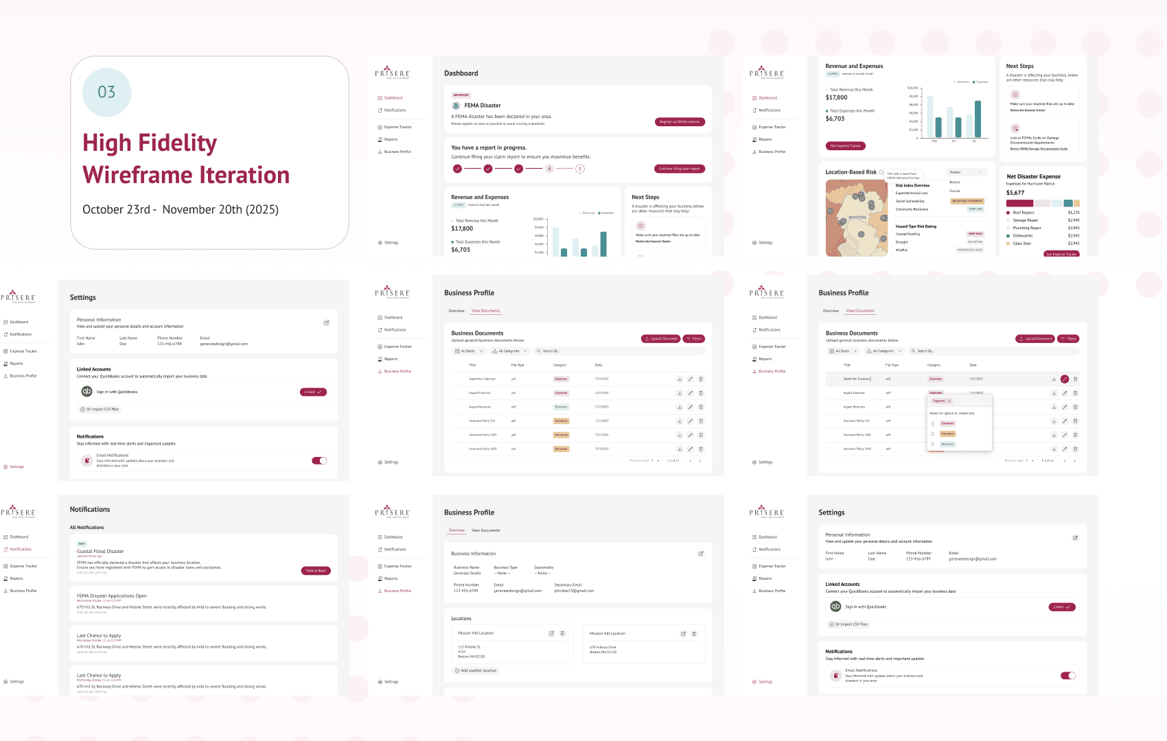
Designing Around Limitation:
THE PROBLEM: The client requested a "Business Risk Card," but the custom metric was mathematically unfeasible for the engineering team to calculate
THE PIVOT: I iterated through multiple concepts, moving from a single Risk Score, to Risk Factors, and finally landing on actionable Next Steps and Location-Based Risk.
THE SOLUTION: Keeping in mind the technical gap, I independently sourced the FEMA National Risk Index for the developers, turning an unbuildable feature into a functional, data-backed metric.
7+ Dashboard Iterations
Conducted testing on users to test out optimal views.
Created a card system that would show 'at-a-glance' content, becoming our strongest feature and ultimately serving our audience better


Reflections
1. Navigating through ambiguity
Learnt to design even when core details (like risk metrics) were undefined, by maintaining close communication with engineers and iterating as constraints became clear
2. Executing under fast timelines
Worked within an accelerated pace while delivering core screens (dashboard, notifications, settings, business profile) on schedule
Final Deliverables:
Dashboard: Refined it to simple and understandable metrics over dense analytics
Notification: Worked with engineers to translate FEMA updates into UI display
Business Profile: Built a centralized profile to store essential general business information used for claims documentation
Settings: Developed a scalable, componentized settings framework accommodating alert preferences, privacy, account controls, integrations, and accessibility.